Koninklijke Binnenvaart Nederland
2021 — visual identity
It's early 2022 when two major Dutch inland shipping organizations officially agree to merge into one beautiful organization. All the collective members had to come together. My objective was to make a real 'everyone's friend' of an identity and leave all the old sentiment out, without loosing the mutual character.
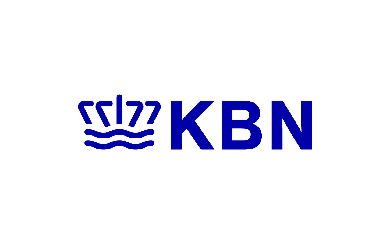
Meet the KBN identity. A real everyone’s friend, with a strong, established look and a nice nod to the industry.
Meet the KBN identity. A real everyone’s friend, with a strong, established look and a nice nod to the industry.


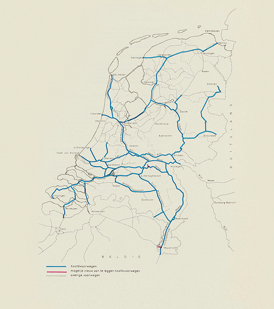
The logo represents the Dutch waterways. Our country is connected by a massive amount of rivers, canals and even a closed off inland sea. These very important logistic arteries connect the ports to the European inland. I created an abstract version of these waterways as the main logo.
Being royal means you can show a crown. Many famous companies like KLM and Ahold have a beautifully designed crown. In this case I liked to add a wink to the industry, so the KBN crown represents a couple of barges in front view on top of a flowing river.
The logo is finished by the amazing Theinhardt typeface by the designers at Optimo.

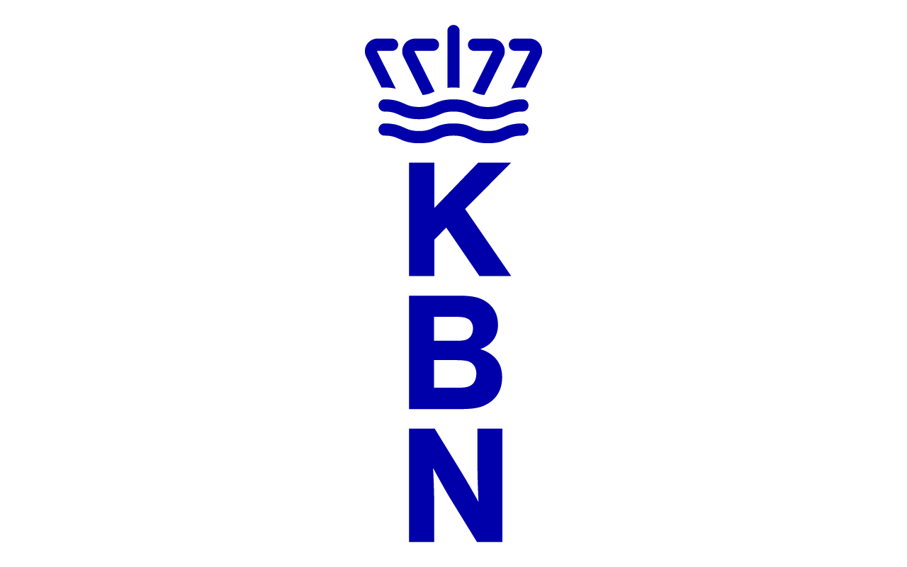
The secondary logos are all based on the abbreviation plus the crown to make it useful for every occasion.
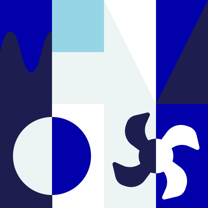
The stylistic elements for this identity are based on the visual language you’ll encounter on the inland water ways. The intricate system of shapes, arrangements and colors inspired me to create a bespoke visual system for KBN. It has a strong visual resemblance to the nautical signs, buoyage and flags.
![]()
![]()


The stylistic elements are used static on printed matter, and animated on digital assets.


For this project I had the luck to work together with the amazing team at Getting the Market. The absolute marketing masters for the maritime and logistic market.
© seph rademakers 2022