
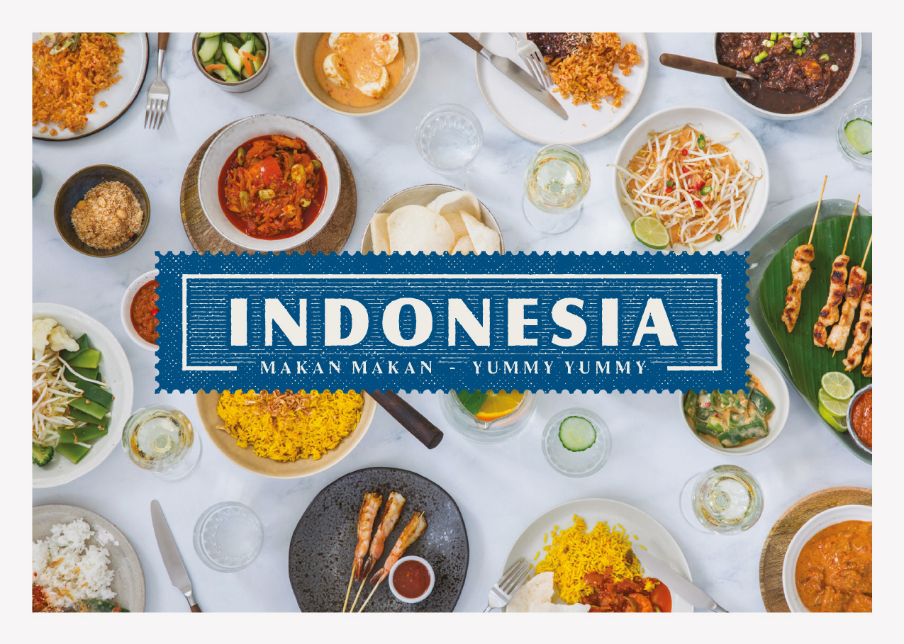
Indonesia
2018 — brand identity & spatial designRestaurant Indonesia started back in 1975.
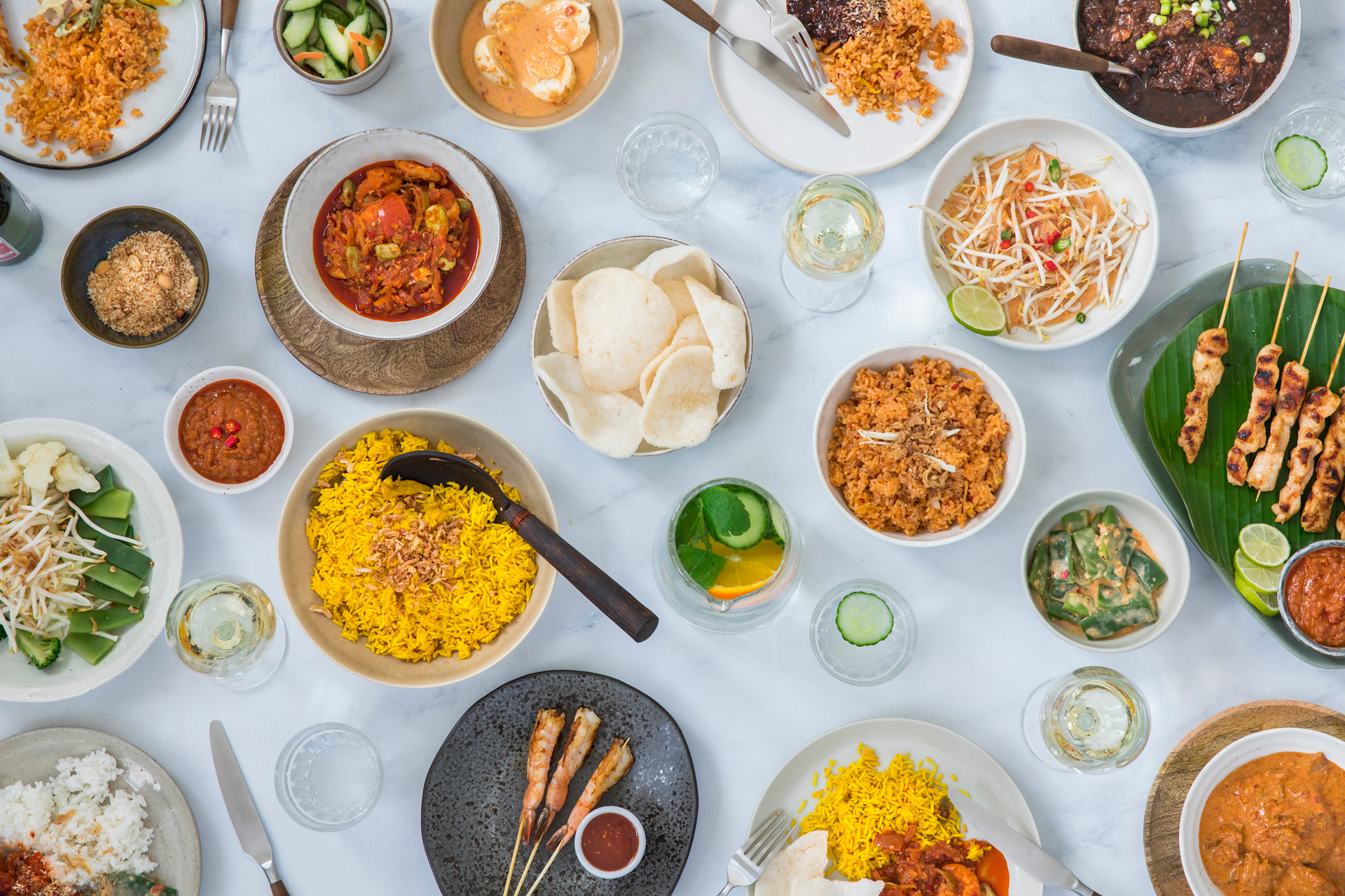
A family business that still serves the most delicious, vibrant Indonesian food to generation after generation. A true icon in Rotterdam and far beyond.
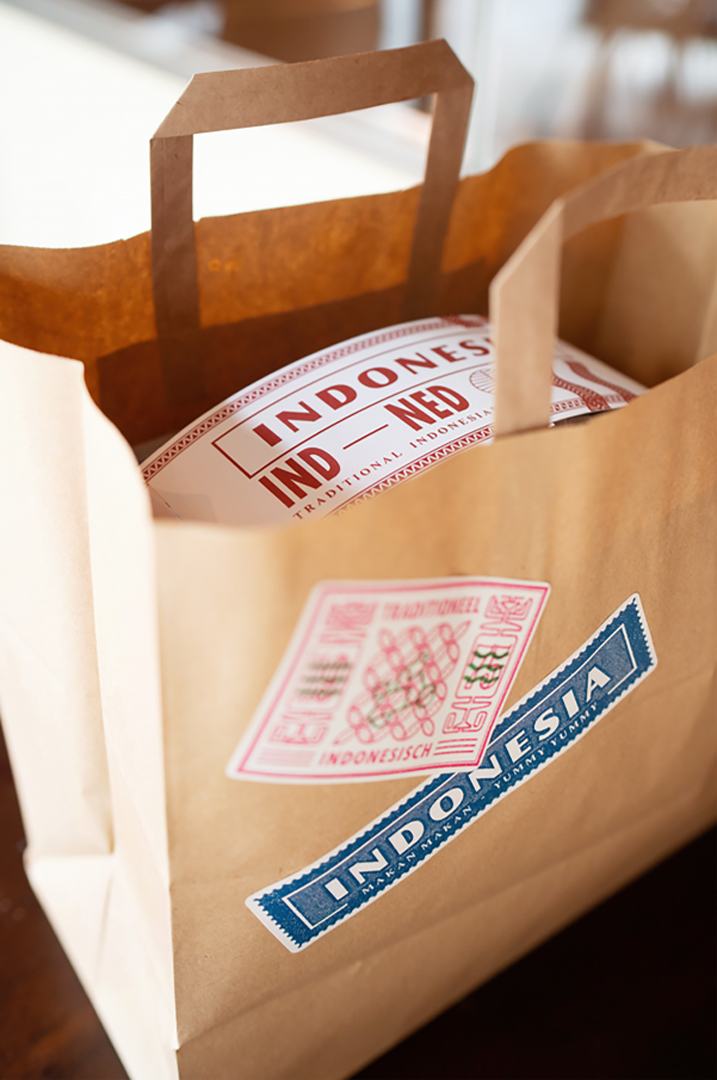
A new immersive brand vision was created and the identity was designed in homage to the rich and beautiful design of the abundant airmail sent between The Netherlands and the Dutch East Indies. The elated feeling of receiving an overseas postal package was the starting point for a large variety of simple items that transform your food delivery into a true present.


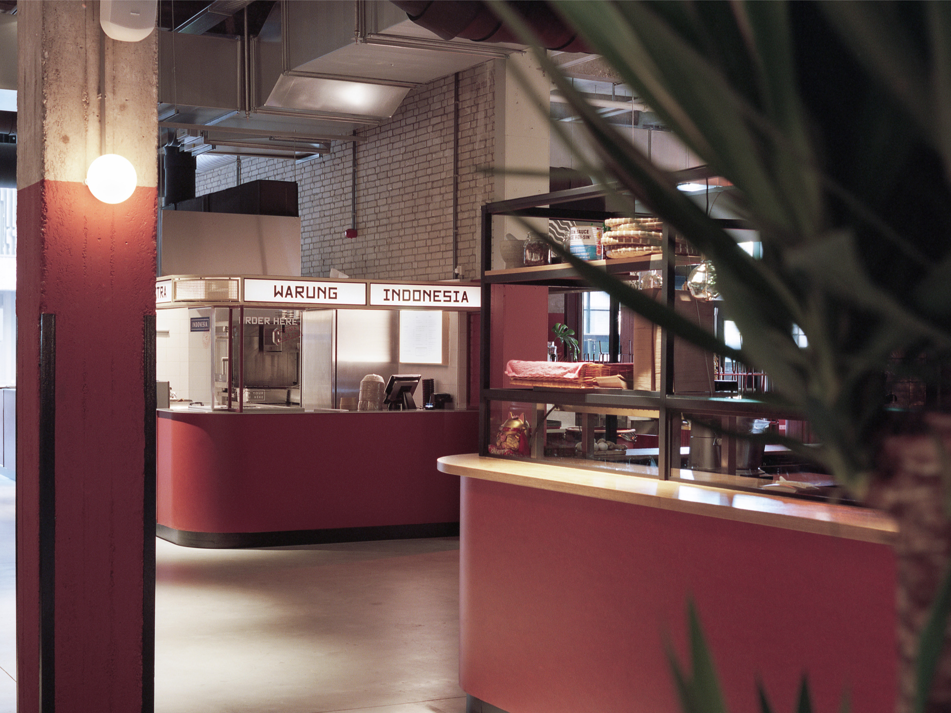
Indonesia opened it’s first Warung at the Foodhallen Rotterdam, housed in a wonderfully restored warehouse. ‘Pakhuismeesteren’ shows four Indonesian islands on it’s iconic facade. It was a no-brainer to use that typeface as an inspiration to create the custom font for Indonesia.

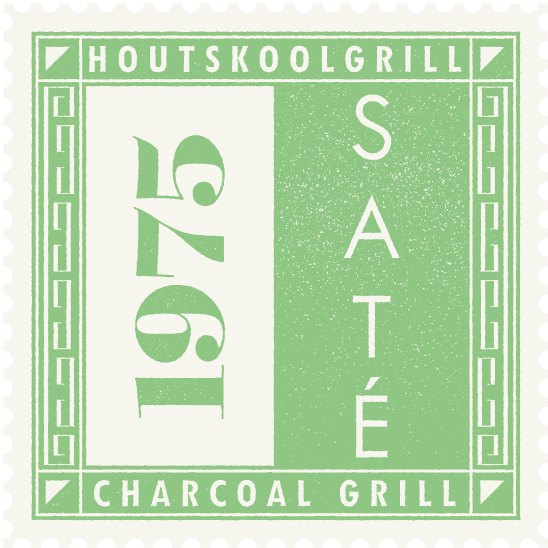
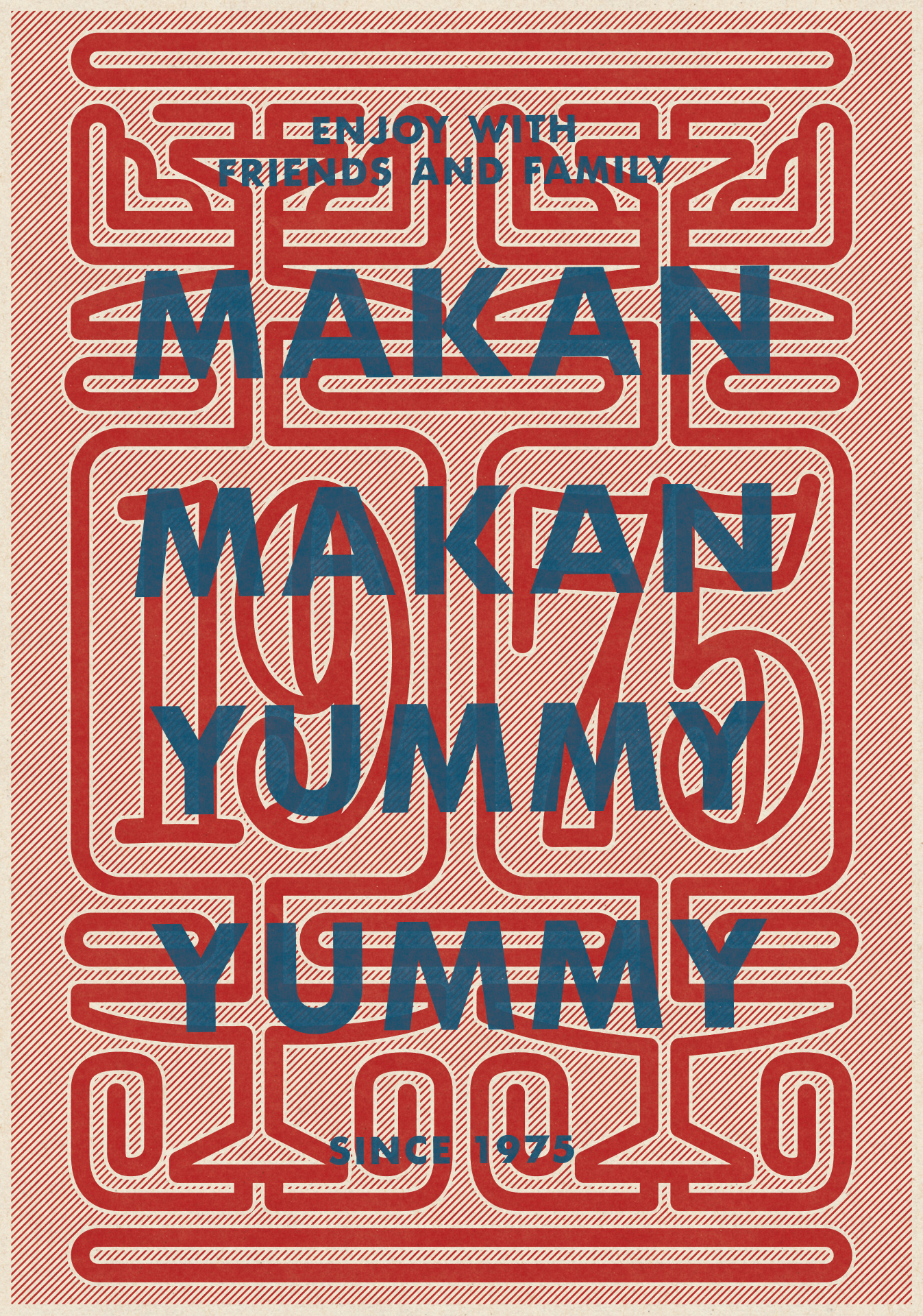
the custom typeface based on the brickwork font on top of the historic building
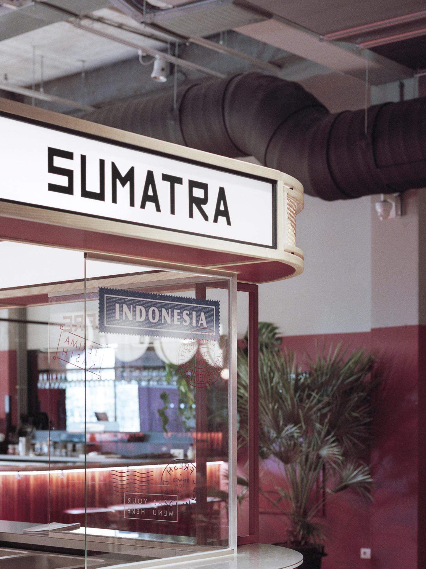
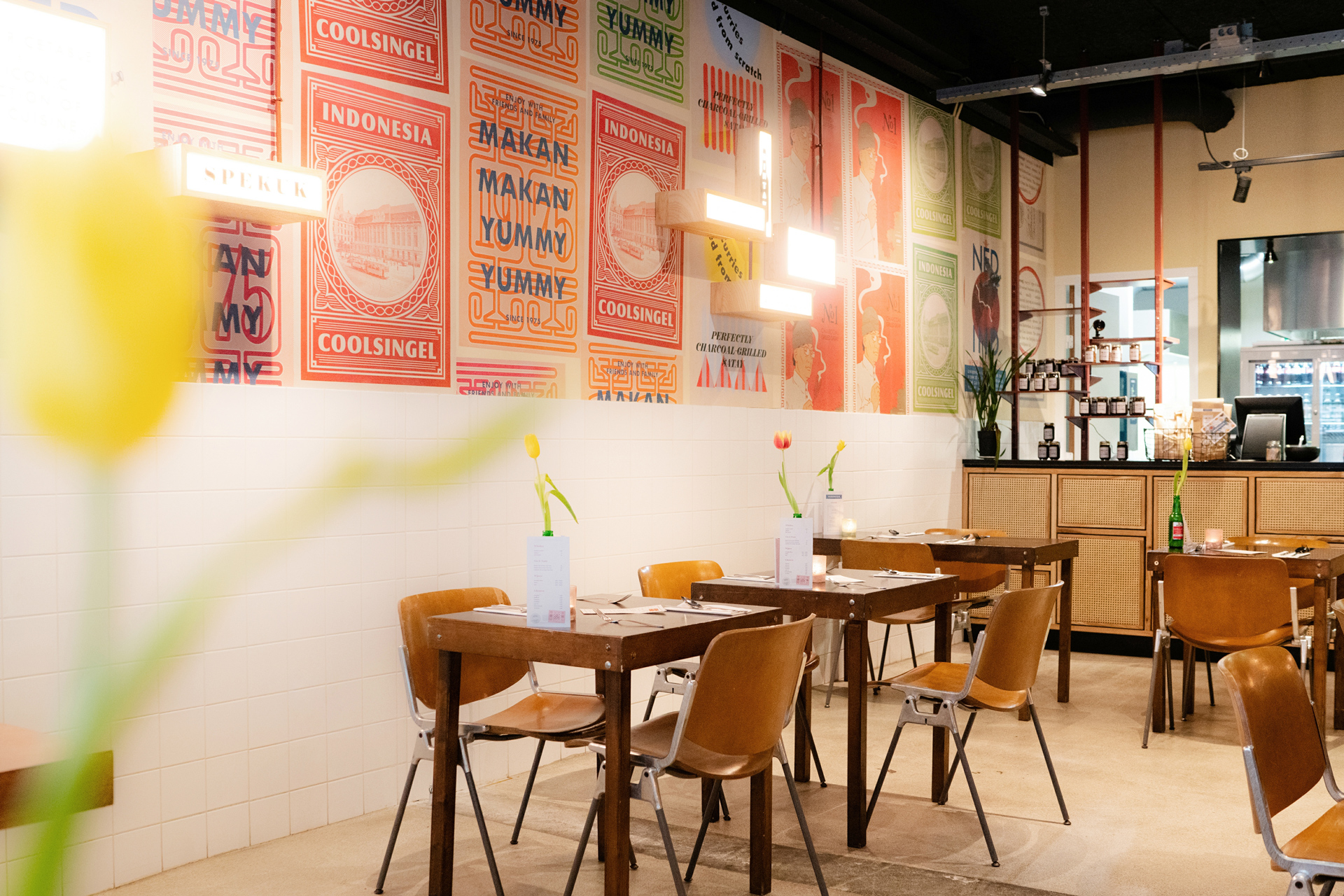
The interior- and spatial design of the Warungs combines colonial craftwork elements with clean and contemporary lines, materials and finishes. Avoiding cliches, respecting the beauty of the past and embracing the boundaries of the given space.

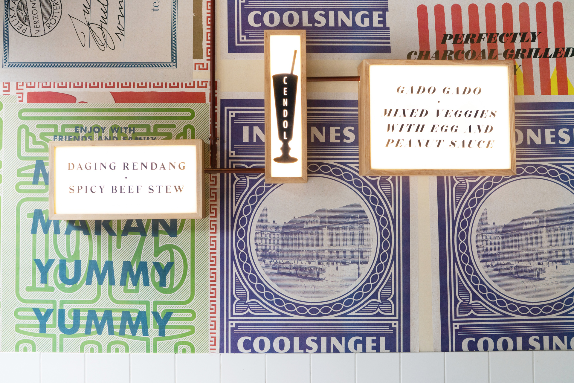
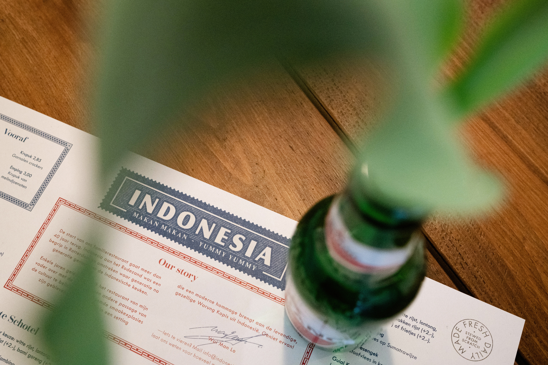


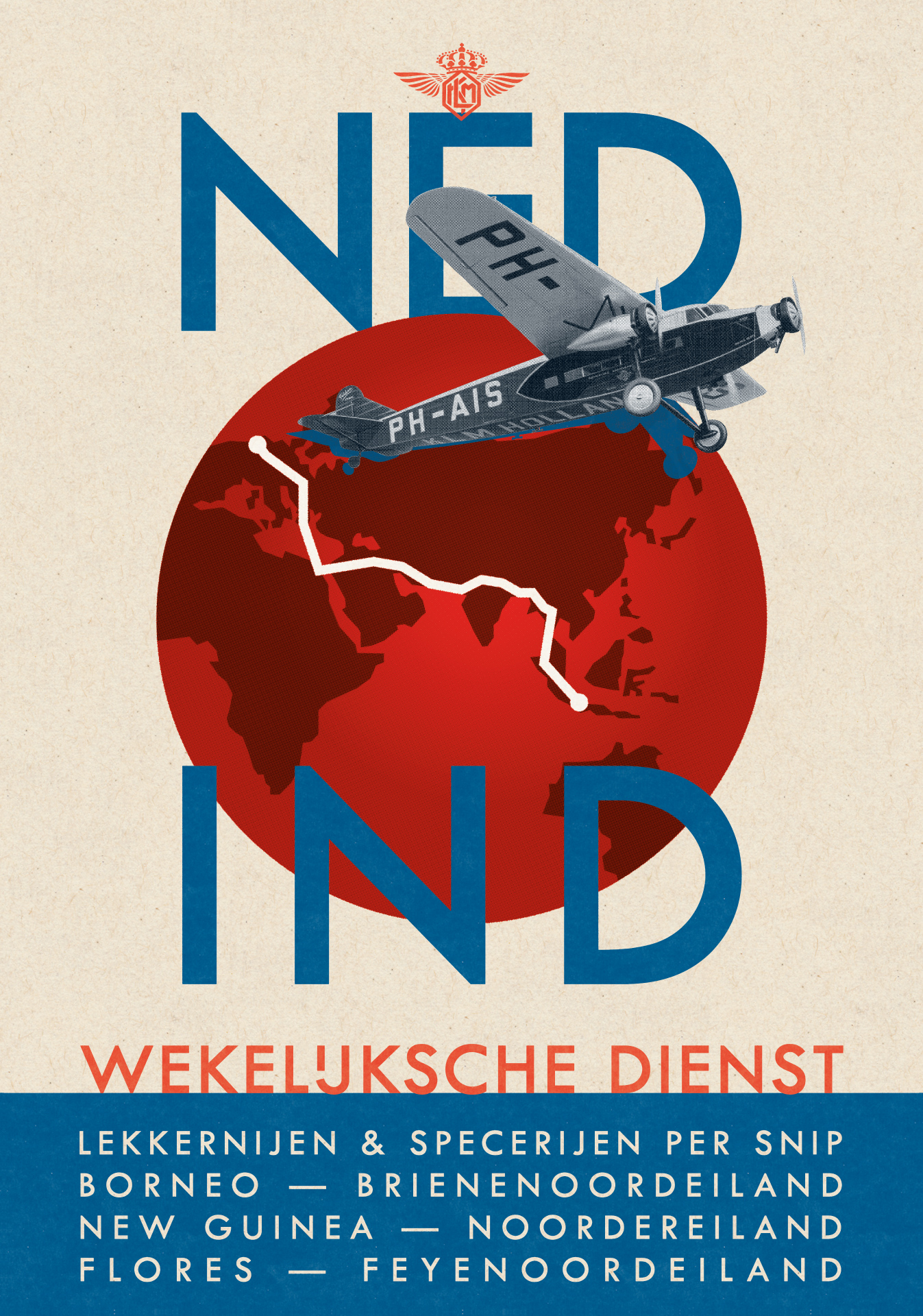
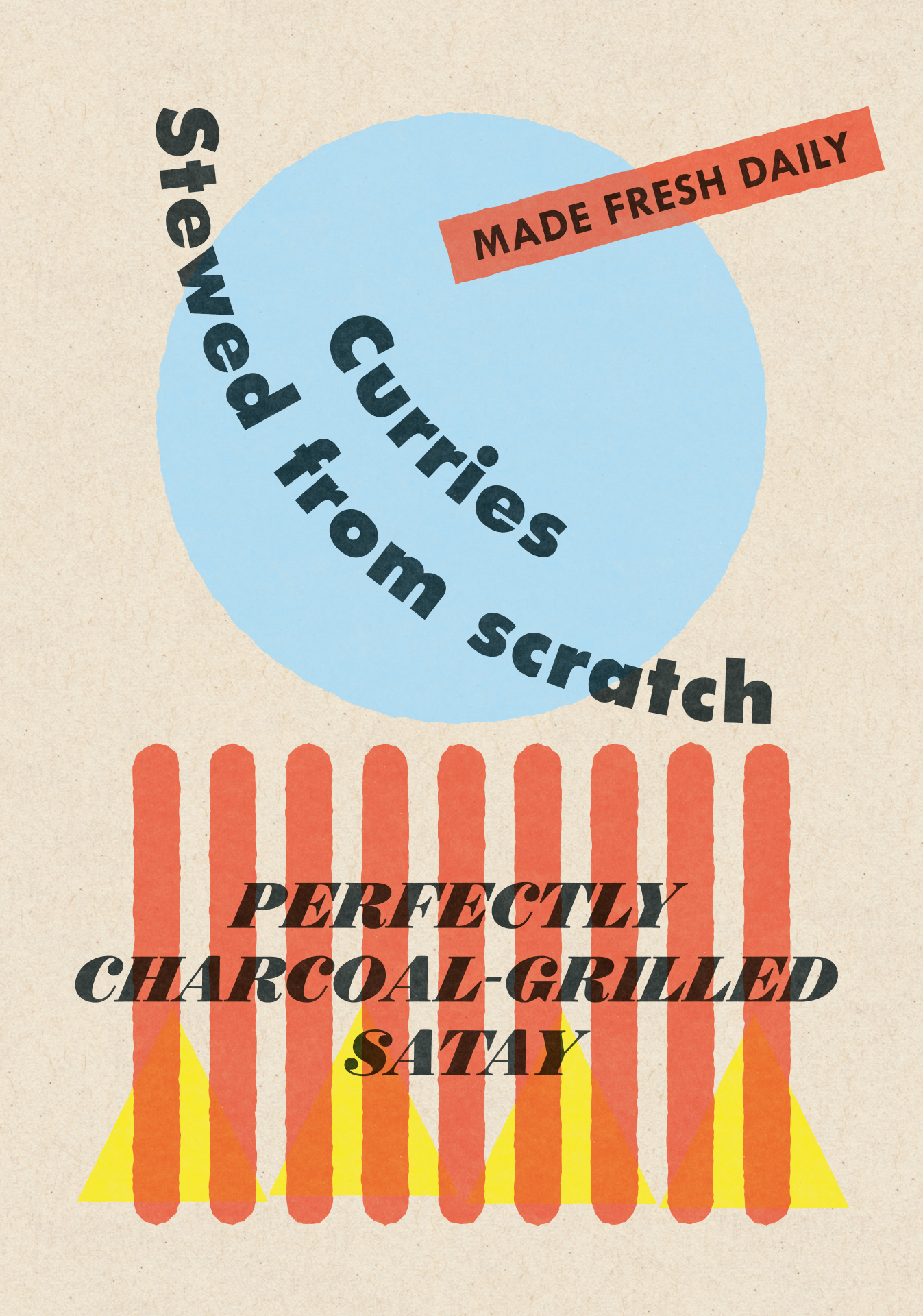

To enrich the interior and packaging a series of posters and postcards was created in the style of official documents, vignettes and stamps from the past. Honoring the beautiful history, the culture and the people that make the brand.

© seph rademakers 2022