Zwart Nazareth
2017 — concept & designWhile working closely with the team at House of Herman Jansen, I discovered more and more about the history of the company and Schiedam. The town’s past had some very interesting and a wonderful opportunities to highlight the amazing potential of their products.

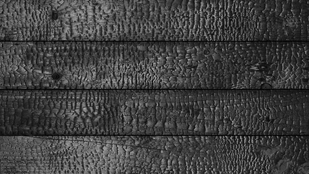

The concept for Zwart Nazareth was born by combining the company’s aged jenevers and the former town’s nickname Zwart Nazareth (Black Nazareth) into a super premium dark spirit. In the 19th century Schiedam was called Zwart Nazareth. The downside of being the Jenever capital was a black charred and heavily polluted city.
“The air is charred by the many glass factories and distilleries. Black clouds are fanned lightly by the town’s massive windmills”
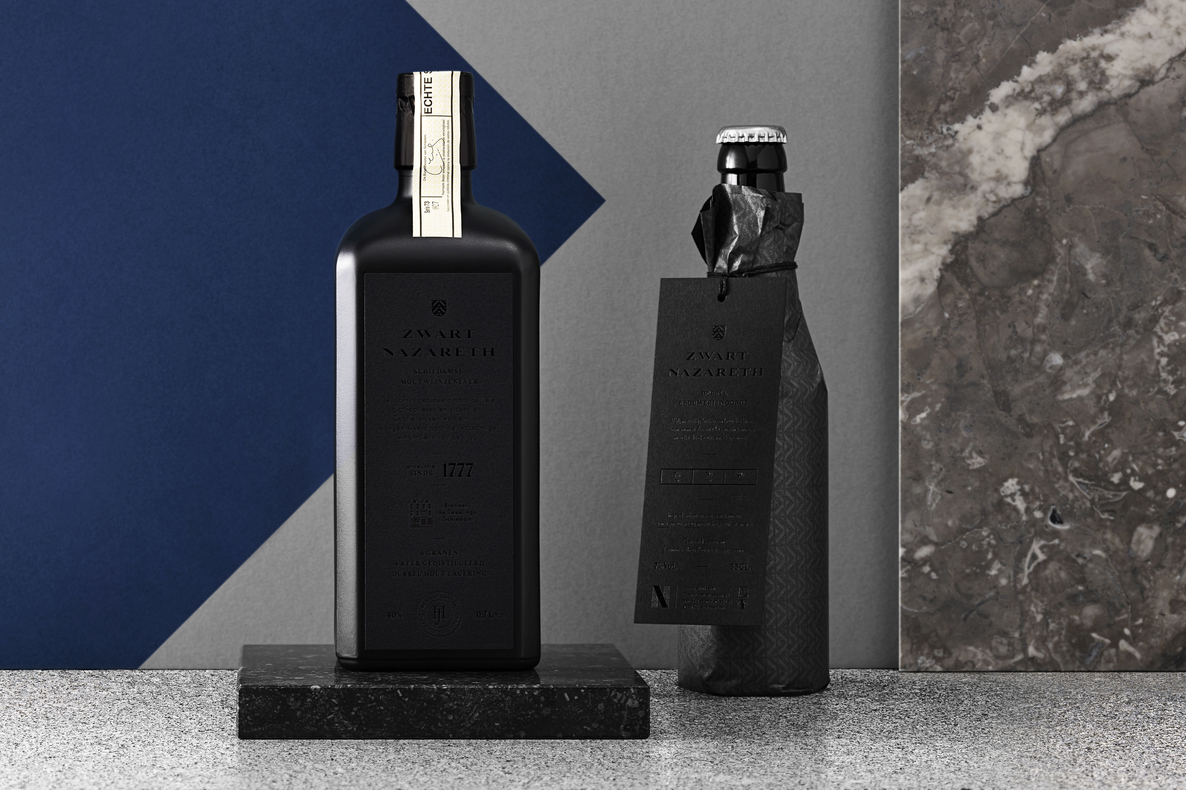
Zwart Nazareth perfect serve with black hotfoil on black paper and custom black on black silk paper wrappers.
Zwart Nazareth has a modern typographical basis and a heraldic touch to achieve the mysterious, 100% black appearance. It was a serious challenge to produce the matt black labels with the glossy black print but the final result looks stunning.

Brouwerij Noordt (a local brewery) completed the perfect serve by brewing a dark beer with the same malts that went into the Jenever. Zwart Nazareth is served as a traditional Dutch ‘Kopstoot’ (a so-called headbutt). A tulip-glass with Jenever served with a beer as a chaser on the side.
© seph rademakers 2022